Your walls are doing more than just holding up the roof; they are actively dictating how your nervous system regulates itself. If you have been feeling stuck, anxious, or strangely exhausted lately, the answer might not be in your head—it might be in the paint can.
Beyond Aesthetics: The Invisible Power of Your Walls
We tend to think of home decor as a superficial pursuit. We treat it like fashion—something we do to impress guests or keep up with trends. But environmental psychology tells a much different, more urgent story. Your surroundings are not just a passive backdrop for your life; they are a mirror and a regulator of your internal emotional state.
As of March 2026, psychologists are noticing a fascinating and somewhat concerning shift in consumer behavior. There is a rising trend where individuals struggling with lower self-esteem are subconsciously gravitating toward muted browns and pale grays. The theory is that these colors offer "emotional containment." They allow a person to blend in, to avoid the social "spotlight," and to disappear into their own environment. It is a defense mechanism painted right onto the drywall.
This underscores a core tenet of environmental psychology: we shape our buildings, and then our buildings shape us. If you surround yourself with colors that signal "hide," you will eventually find yourself hiding from your own potential. Conversely, if you understand the biological impact of color, you can reverse-engineer your environment to support the life you actually want to live.
The Biological Blueprint
To understand why color affects us, we have to stop looking at it as art and start looking at it as physics. Color is light, and light is energy traveling in wavelengths. When those wavelengths enter your eye, they don't just create a picture. They trigger a cascade of chemical and electrical signals that travel straight to the hypothalamus—the part of the brain responsible for governing your hormones and your autonomic nervous system.
This isn't magic; it is biology. It is known as Arousal Theory.
The principle is simple: "active colors" (long wavelengths like red, orange, and yellow) require more energy for the eye to process. This physical effort translates into increased physiological arousal. Your heart rate can actually speed up. Your blood pressure can rise slightly. Your brain switches into a state of alertness.
On the flip side, "passive colors" (short wavelengths like blue, green, and purple) are easier for the eye to process. They signal the autonomic nervous system to slow down. A comprehensive study concluded in late 2025 backs this up with hard data. Participants placed in blue and green rooms reported significantly higher levels of mental clarity and stress relief. Meanwhile, those placed in red and yellow rooms showed 20% higher levels of physiological arousal and alertness.
There is also the Ecological Valence Theory (EVT) to consider. This theory suggests that our color preferences are hardwired by our ancestors' survival experiences in nature. We find comfort in blues because a clear blue sky signals good weather and safety. We feel peace in greens because lush vegetation means food and water. We feel an instinctive aversion to murky yellows or browns because, in nature, those often signaled rotting food or contaminated water. Your brain is constantly scanning your living room for these primal cues.
Eye-tracking data from early 2026 reinforces this. While warm colors like red capture our attention faster (about 0.3 seconds faster than cool tones), we don't look at them for very long. Cool colors, however, generate significantly longer "fixation times." This means they foster deeper cognitive processing. If you are trying to do deep work or engage in quiet contemplation, a cool-toned room literally helps your brain settle into the task.
Color Profiles in 2026
We are seeing a move away from the stark, clinical white boxes of the early 2020s. People are realizing that "clean" does not always equate to "calm." Sometimes, it just feels sterile. The color trends of 2026 reflect a collective need for resilience and grounded optimism.
The Rise of the "Hidden Gem"
One of the standout shades for this year is a smoky jade green often referred to as "Hidden Gem." This isn't a bright, lime green that screams for attention. It is a deep, restorative hue that taps directly into that Ecological Valence Theory I mentioned earlier.
This color is being identified as a "new neutral." It provides the restorative benefits of nature—that feeling of walking into a dense, quiet forest—while grounding you in a sense of mysterious renewal. It is particularly effective in spaces where you need to decompress after a high-stress day. It signals to your body that the "hunt" is over and it is time to rest.
The Productivity Power of "Universal Khaki"
On the other end of the spectrum, we have Sherwin-Williams' 2026 Color of the Year, "Universal Khaki." Now, before you roll your eyes at the word "khaki," understand that this isn't the color of a boring pair of office trousers.
This specific shade carries strong yellow undertones. Environmental psychologists recommend it for multi-use spaces because those yellow undertones provide a "gentle optimism." It supports productivity without the nervous overstimulation of a bright, pure yellow.
I know how critical this balance is from my own experience. I juggle a lot of different projects—building websites, managing marketing campaigns, and writing. My work requires deep-work bursts to keep my focus sharp. If I tried to work in a bright red room, I’d be burnt out by noon. But a sterile white room makes me feel isolated. I need an environment that feels warm enough to keep my energy up, but neutral enough that it doesn't distract me when I'm trying to solve a complex coding problem. That balance is what keeps the "brain fog" at bay.
Practical Application
So, how do you take this science and apply it to your own four walls? You don't need to repaint your entire house in a weekend. You just need to be strategic about the emotional outcome you want for each room.
1. Leverage "Dopamine Colors" in Transitional Spaces
You might have heard of "Dopamine Decor." This is a design movement using high-saturation hues to trigger neurotransmitter release. While you probably don't want your bedroom painted electric neon, these colors are perfect for "transitional spaces"—hallways, entryways, or laundry rooms.
These are low-light areas where we usually don't spend much time, so we don't risk overstimulation. Using highly saturated pinks or electric blues here can give your brain a quick "hit" of pleasure and energy as you move from one task to another. It combats mental fatigue and breaks up the monotony of the home.
2. Manipulate Space with Cool Tones
If you are living in a compact urban apartment or have a small home office that feels like a closet, color physics is your best friend.
We know from spatial perception research that color saturation and lightness influence whether a room feels "cramped" or "expansive." Light blues and greens visually recede. This means they look like they are moving away from you. When you paint the walls of a small room in these cool tones, you are essentially tricking your brain into perceiving the space as larger than it is. This reduces the "closed-in" feeling that often triggers low-level anxiety or claustrophobia.
3. Design for specific outcomes
Stop asking, "What color looks good?" and start asking, "How do I want to feel in here?"
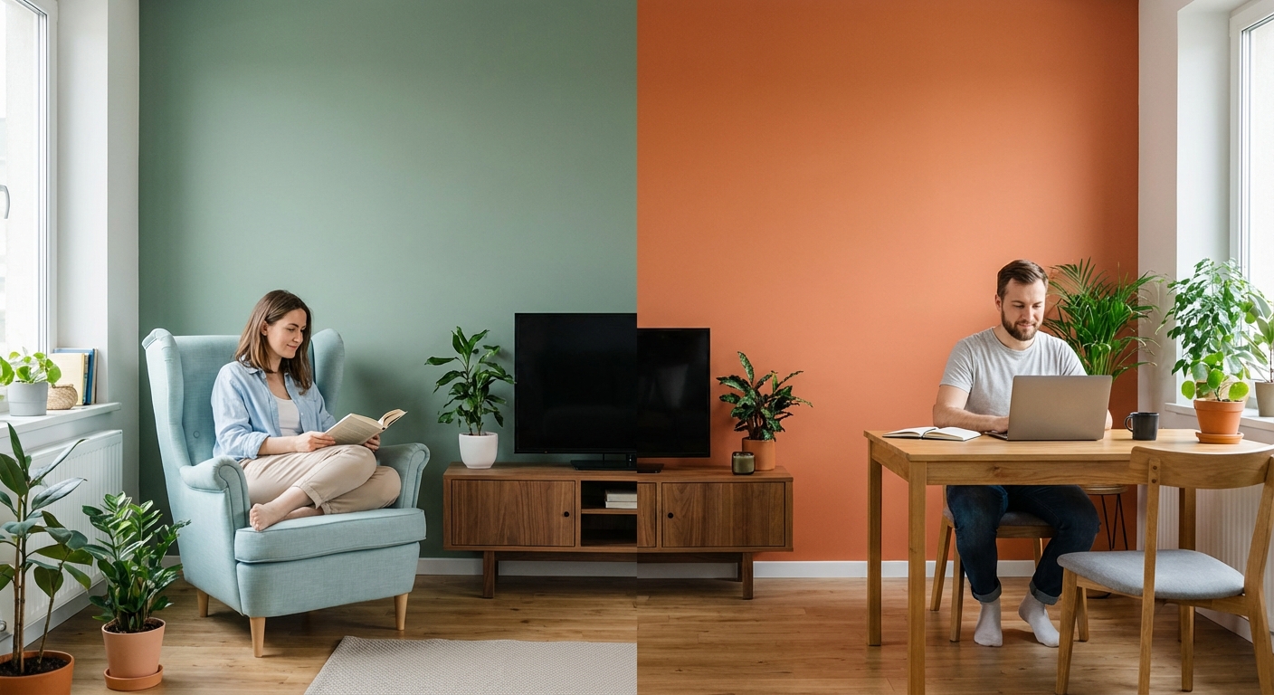
If you have a room dedicated to prayer, silence, or reading, avoid reds and oranges. They will keep your heart rate slightly elevated and make it harder to settle into stillness. Stick to the deep greens or soft blues that encourage long fixation times and deep processing.
If you have a home gym or a space where you need to feel active and alert, that is where your warm tones belong. A splash of orange or yellow can act as a subtle caffeine hit for your visual cortex, prepping your body for movement.
Conclusion
The world is chaotic enough. You cannot control the traffic, the economy, or the news cycle. But you can control the four walls you wake up to every morning.
By understanding the science of environmental psychology, you stop being a victim of your environment and start becoming the architect of your own mood. Whether it is painting an office khaki to support your work ethic, or painting a bedroom deep green to support your rest, these are small physical changes that lead to massive internal shifts.
Don't settle for walls that just look nice. Build walls that help you live better.
See also in Life Hacks
15 Hacks for Bag Setup
25 Winter Survival Hacks
20 Hacks to Simplify Your Gift List
20 Hacks for Simplifying Holiday Traditions
15 Hacks for Efficient Travel Packing
10 Hacks for Wallet Setup